

To help me narrow the selection down to ten I used a few rules or criteria to help distinguish the great from the good. Choosing just ten covers was difficult, putting them in some kind of order would be even harder so I've chosen to present them alphabetically... enjoy!
- the cover must work with the music in some way, enhancing the overall experience.
- ... yet it should be able to stand independent from the music as a work of art in itself.
- the cover must be intriguing and withstand long hard looks without becoming boring.
- extra points for inserts, back covers and overall design.
Art Bears - Hopes and Fears


The front cover to Art Bears' 1978 classic album 'Hopes and Fears' is in fact a photograph of a model by EM Thomas, also known as Maggie Thomas. She was closely linked with Henry Cow and their ilk it'd seem as she sung on a small number of tracks as well as mixed some tracks here and there too. She did all the artwork for the Art Bears releases as well as a number of Chris Cutler and Fred Frith albums. It's unclear who did the painting on the back or designed the rest of the packaging.
'Hopes and Fears' was Art Bears' first album following the disbanding of Henry Cow; I bring this up as I feel the connection between the two groups is very strong and it's interesting to take this into account when looking at this artwork. Henry Cow were known for their long and twisting compositions that featured elaborate instrumentation and a heavy political element. Art Bears continued along the same path as Henry Cow but paired things back; the core group was made up of Chris Cutler, Dagmar Krause and Fred Frith and the tracks likewise were leaner and streamlined... if no less dense and tangly.
The tracks on offer work so well with 3D diorama of the front cover; there is a sense that these tracks all live in the same M.C. Escher style house but inhabit different rooms, each of which defy the walls that contain them. It's easy to get lost within the density of the artwork and likewise it is easy to get lost in the music. The back cover contrasts heavily with the front, featuring a very flat painterly landscape, strangely the front cover has a greater sense of depth than the landscape which appears very flat to a point of almost looking surreal.
I love getting lost in this album and its artwork.
Broadcast - Haha Sound


The artwork to Broadcast's second album proper can be credited to Julian House, a long time collaborator of theirs who it'd appear worked on all of their releases, from 1996's 'The Book Lovers EP' to the group's soundtrack to Peter Strickland's film Berberian Sound Studio. The unique collage style of House which brings together found photography, text and textures worked so well with Broadcast... to the point that it's hard to untangle the music and artwork. In my opinion the peak of their collaborative efforts was the cover and overall design of 2003's 'Haha Sound'. House is credited with working with many many other artists such as Primal Scream and Stereolab and has his own music project in the form of The Focus Group, he is also one half of the fantastic Ghost Box label.
The artwork here is presented on very thick glossy card featuring the old-school 'tip on' design technique. The quality of the material as well as overall packaging is impressive to behold, I'm not sure if the re-issue is as robust (anyone know?). The design features a stark and striking black, white and orange colour pallet, this colour pallet is coupled with text that is used to create shapes and textures. The text reminds me of computer code but the way it is used here gives it a real sense of personality. The artwork and style is consistent all the way through the packaging and makes for a really nice and distinctive design. The music sometimes has a dissonant feel to it and the textures and cut-up images fit well with those feelings.
Rest in peace Trish, your voice and personality still echo through the music you left behind and in House's artwork.


The cover to Captain Beefheart's final album is very fitting. Don Van Vliet (aka Captain Beefheart!) had been privately dealing with health issues such as multiple sclerosis which made working on music and performing live increasingly difficult. His ongoing illness plus his wanting to concentrate on his paintings saw him bow out gracefully with 'Ice Cream for Crow' in 1982, fifteen years after he shook the world with 'Safe As Milk'.
Although not his most famous of albums, 'Ice Cream for Crow' is up there with his best and it seems a fitting place to finish off. The cover features a close up of a Van Vliet painting full of violent textural paint strokes on unprimed canvas. This simultaneously delicate yet raw art style mirrors Van Vliet's gritty voice and the music that skates around and through it. The artwork wraps around from the front to the back of the cover, exposing the edge of the canvas. On top of the canvas are two black and white photographs by Anton Corbijn; the one of Van Vliet is incredibly touching and sees him in the barren desert landscape he called home, his hat off and held against his chest in a final respectful farewell. The photo on the back of the Magic Band shows the enthusiasm these guys had for working together, there is a sense of comradery and excitement in the photo. Van Vliet was notoriously erratic and difficult to work with but in this photo you'd be forgiven for thinking that that was all just myth.
Van Vliet described the title of the album as being a play on the colours black and white, a reference to black and white photography as well a juxtaposition of harshness and sweetness; all of that is here on this cover and it's still fascinating to gaze at.
Devo - Freedom of Choice


A couldn't not have Devo in this list right!? This is Love Without Anger after all. Picking just one Devo cover was a difficult task, I was going back and forth between the Warner Bros. cover for their first Album 'Q: Are We Not Men?...' - which featured the face of golfer Chi Chi Rodriguez taken from the packaging for some golf balls - and this, the worldwide cover for their third album 'Freedom of Choice'. In the end this won due to it's iconic look and how it represents the music.
Devo were (and are) a post-punk band who were influenced in the early days by a mixture of whacked out religion and philosophy and the appropriative, consumeristic Pop Art world. Yet Devo were angry; they felt the world falling apart around them following a mass police shooting that saw the senseless slaughter of fellow students and friends at their highschool in Akron Ohio. Instead of snarly punk songs the band came through with an energetic and agitated pop sound that held up an absurdist distorted mirror to modern life. With their songs they wanted to infiltrate and question pop culture but in the end their sound had such influence that they actually became pop culture.
Part of what Devo used to infiltrate the minds of America was myth, iconography, symbolism and sex. A lot of their work deals with the human urge for sex and how it controls a lot of our day to day actions. They also made a brand out of their albums with each of their early albums coming with an insert full of mail order items to get that Devo look (a look that changed with every album).
With the 'Freedom of Choice' album they created the myth that they were all uniform in height, weight etc, giving the sense that they were all cut using the same cookie cutter! This uniformity and kind of cult-like look made them appear as a single unit, the fact that the band has two pairs of brothers among it's five members only furthers the confusion when looking at this front cover (who is who?). The American flags that frame the image and the overall red, white and blue look only furthers this sense of blind conformity. Yet it's incredibly knowing and absurd, what are they wearing, what have they got on their heads!? It's a cover that is incredibly striking yet simple and almost banal. It's just absolutely phenomenal and represents so much about what Devo is and what the tracks on 'Freedom of Choice' are all about.
Faust - The Faust Tapes


The first Faust album I bought was the reissue of 'Faust IV' in 2006. I had not heard them before but had seen the cover of their first album and had read about them... from what I read I was excited to hear their sound, expecting it to be like nothing I'd heard before. In a sense it was very unusual to my ears but at the same time I could feel the time it was recorded, it felt 'vintage'. You can really hear the 70's tape production in that record. I was not expecting the album to hold little ditties like 'The Sad Skinhead' and at first I did not know what to make of the overall schizophrenic nature of the album but it has grown on me over time.
Next I got their first two album which absolutely blew me away, suddenly 'Faust IV' made a lot more sense. One album always eluded me though, the much talked about 'The Faust Tapes' from 1973. It was pretty hard to find on CD back in the mid-2000's but eventually I started to buy vinyl and it was always in the back of my mind... must get 'The Faust Tapes' on vinyl! One day when walking around Lincoln I went into an antiques shop that sold old wooden golf clubs and random bits and bobs, in the corner was a little box of records. That day I picked up this, Black Sabbath and Scott Walker records... success!
'The Faust Tapes' was originally released for the price of a 7" single in a marketing scheme that paid off and spread the Faust name far and wide. But this is far far far from a pop record, it's their most collaged, long form and generally 'out there' release; to think thousands of people were buying this back in 1973 without knowing what they were getting themselves into! The front of the record features text that explains that this should 'not be regarded as their third album, but a bonus release' that wasn't originally intended to be made public but due to the interest in the UK was released. It also says that it is all played live with no post production but I think that's a lie! I can feel that someone has arranged this pretty heavily (maybe I'm wrong?).
The main body of the text is filled by clippings from UK and French publications talking about the band in the years 1972-73. We've got Best, Rock & Folk, Sounds, Disc, Extra, Pop Music and New Musical Express. This is great as it gives a real snapshot of the impact the band were having at the time. I really like the layout and typeface of the text, it's incredibly direct and easy to read but there is just so much to read! This wall of text I imagine helped sell more copies also (it helps that John Peel wrote the piece for Disc). On the back is a painting by Bridget Riley. When I was studying art at GCSE and A-Level I absolutely loved Op Art and in particular Bridget Riley, having this on the back just brought back lots of memories. It's hard to get a sense of the optical effect when looking at a computer screen but in person it is really startling and draws you in. I think the image is a really good fit for the album and it's a shame they didn't work together on future releases and that the image wasn't used on the reissues that surfaced after the initial release.
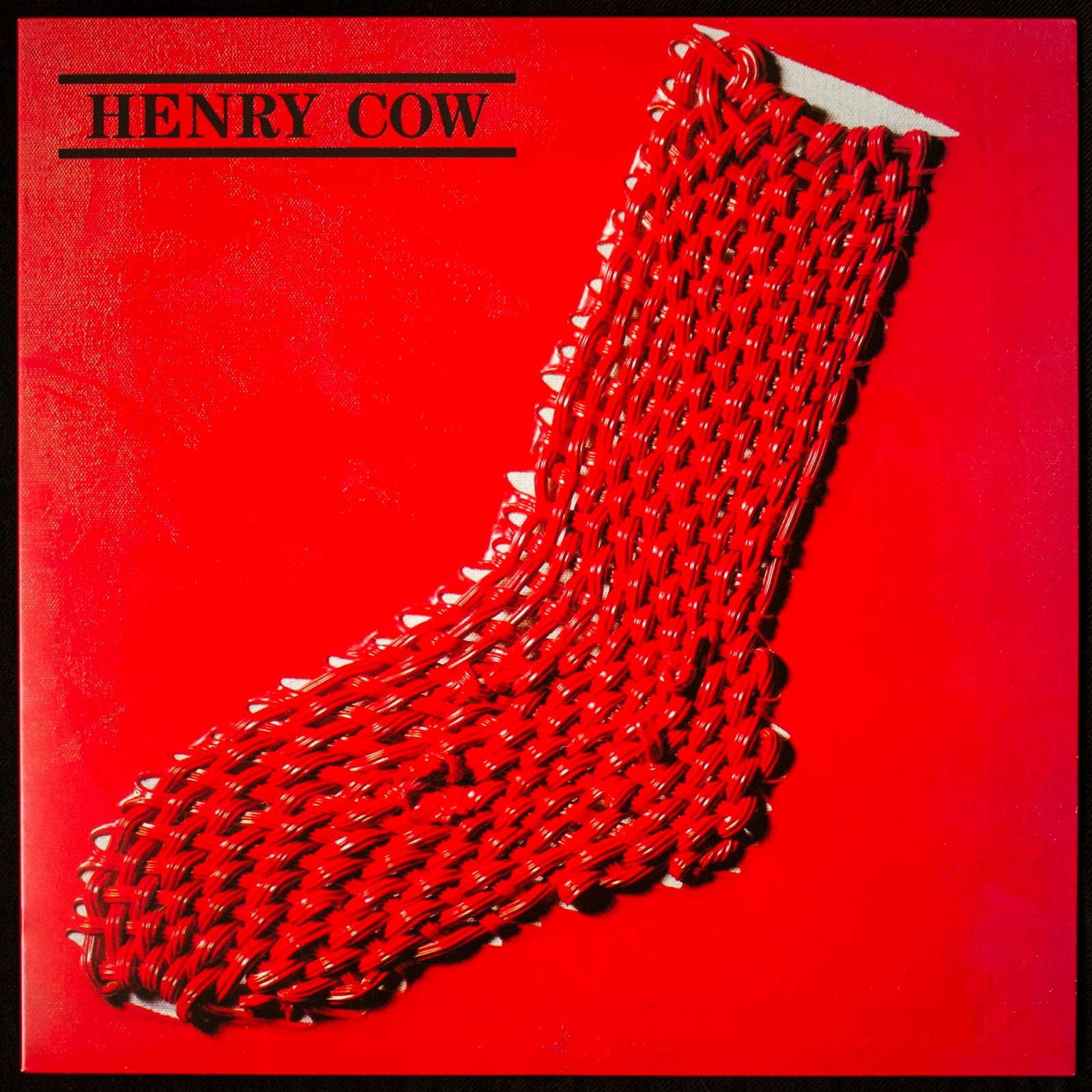
Henry Cow - In Praise of Learning

In some ways I feel unequipped to talk about this album; there is obviously a heavy political message that runs through the album but I haven't delved too deeply into the particulars of it. I do not know of the political climate in 1975, I can only speak to what energy I get from this music and the cover of this album, 41 years (!) after the fact.
The cover of the album is by Ray Smith who did the first three Henry Cow album covers: all featuring this woven sock motif but repainted each time to 'suit the temper of the music' as drummer Chris Cutler once said. Henry Cow's first album 'Legend' featured nothing but the sock on the front, it looked homely with it's red and blue colour scheme against what looks like a plastered wall. When I see this album cover I think of humble beginnings, working as a unit and as a family. The second album 'Unrest' features a much darker and tar like look, there are hints of colour coming through the black or reflecting off the thick oil texture but the feel is of being smothered. I find 'Unrest' the most difficult Henry Cow album to connect with and I guess the artwork suits the music in that sense!
After 'Unrest' Henry Cow teamed up with Krautrock pop group Slapp Happy for a semi-collaborative album called 'Desperate Straights'. The album featured Henry Cow joining Slapp Happy as instrumentalists; although Moore and Blegvad of Slapp Happy wrote all the tracks it was obvious Henry Cow as a musical and political force was heavily guiding these songs.
The same year as 'Desperate Straights' Henry Cow (now expanded by three having cannibalised Slapp Happy) came through with this, their third album 'In Praise of Learning'. It's hard not to see this title as a reference to Cornelius Cardew's 1971 'The Great Learning' which in a way brought spoken political word and philosophy into the avant garde of the time. Cardew would shortly go on to disown the long, improvised and experimental form and prefer to give messages direct with pop like short political songs. Dagmar Krause, the incredible and distinctive vocalist from Slapp Happy would act as spokesperson for Henry Cow voicing a snarling, angry text that acts as the spine of the album. Henry Cow had always been a political group but now having a direct channel via the vocals of Krause the energy and bite of the political message was brought right to the forefront.
This new found political directness manifests in the cover art, painted in a Mao red, all other colours be damned! Henry Cow is written in all caps and framed by two thick lines, it's as if everything was leading to this point. The first album had no text, the second had lower case and hand written, this third album has bold, all caps typeface. The back of the album contains all the lyrics written out to be read and followed, this was a statement and the paint had not yet dried.
Kraftwerk - The Man Machine


Ah yes, Kraftwerk. So many great album covers but I had to go with 'The Man Machine'. Everything about this is just so distinctive and eye catching. They would go on to ruin all their album covers with their remasters but that's a topic for another time!
This album marked a distinct step for Kraftwerk, they had sort of created an aesthetic beforehand through their 'straight' and professional look on 'Trans Europe Express' which brought to mind 1920's style with a space-race, patriotic and utopic air but 'The Man Machine' saw them adopting culture whilst also creating a visionary and futuristic look. This was 1978, the year of Grease, of Bee-Gees, the last massive surge of disco whilst punk ate away the rug from under their shiny dancing feet like bacteria. It's a strange time in music and Kraftwerk come out with the most robotic and uncool look and sound, there's no swing or boogie here yet they had the musical foresight to know where music would be moving.
The cover features artwork inspired by the Russian Constructivist art movement; in particular the art work of El Lissitzky (he is even credited on back for inspiring them). You can definitely feel his influence on the colour scheme and the geometric shapes on the back but the way Kraftwerk insert themselves into the artwork is really interesting to me. Although they were going for a robotic look and feel with this album their presence grounds it all somehow. The music is otherworldly but it all came from these four gentleman. I really like that you can see the red stair banister too, it just - again - adds a human element, it makes obvious that this is a photo shoot. The overall look is very clean cut but not sanitised, it still has some rough human DNA in there. This gets to the heart of what I love about Kraftwerk, they still sound and look human. There are Dance producers now pushing out incredibly boring and sterile music but Kraftwerk always had a heart at the centre of it all.
The cover features artwork inspired by the Russian Constructivist art movement; in particular the art work of El Lissitzky (he is even credited on back for inspiring them). You can definitely feel his influence on the colour scheme and the geometric shapes on the back but the way Kraftwerk insert themselves into the artwork is really interesting to me. Although they were going for a robotic look and feel with this album their presence grounds it all somehow. The music is otherworldly but it all came from these four gentleman. I really like that you can see the red stair banister too, it just - again - adds a human element, it makes obvious that this is a photo shoot. The overall look is very clean cut but not sanitised, it still has some rough human DNA in there. This gets to the heart of what I love about Kraftwerk, they still sound and look human. There are Dance producers now pushing out incredibly boring and sterile music but Kraftwerk always had a heart at the centre of it all.
The Residents - Eskimo


This is a difficult one for me to pin down, why do I like this cover so much? I guess for me it's a mixture of things, it's the first time they came out wearing the distinctive eyeball masks and generally I like the art style and composition of this one.
'Eskimo' - like almost all Residents albums - is an album driven by a concept. The concept this time is the life of the Inuit and in particular their ceremonial music. Included are a bunch of false facts about the instruments Eskimo's play and what notes the Eskimo musical key contains, this elaborate myth building is a vital part of The Resident's DNA which goes right down to the musicians individual identities (or lack thereof). They present themselves here as ethnologists, historians, researchers of an 'exotic' far off land. The music suggests or poses to re-present the sounds of the Inuit, what that amounts to is an incredibly raw and cold sounding record, one that is wild and tribal. The Residents bark in a jibberish language as synth and percussion wash around the audio field.
The front cover reminds me of tourist pictures where people almost attempt to claim the land as their own with their posturing for the camera. Yet the landscape here is no more than paper thin, it looks like a theatre set that has been airbrushed around them. The overall design of the album is very distinctly The Residents, mixing both high art and bad taste in a way that boarders on Dada or Surrealist in nature. As the back of the cover suggests 'warm clothes or a blanket should be within easy reach'. There's a storm-a-brewin.
Throbbing Gristle - 20 Jazz Funk Greats


All these records are from my personal collection, most of which I've had for at least two years. This on the other hand is a fairly recent addition to the collection, Throbbing Gristle's '20 Jazz Funk Greats' from 1979. I haven't heard much Throbbing Gristle, I heard snippets here and there before this but I prefer to listen to entire albums as they were originally intended. I knew '20 Jazz Funk Greats' was Throbbing Gristle's most well loved record and that it had a big impact on the dark electronic music scene with labels such as Mute and groups like Cabaret Voltaire and Fad Gadget rising in its wake. I knew it was going to be a pretty difficult listen but it still exceeded expectations.
The album isn't simply one thing or another, it's like a melting pot of many different conflicting emotions, moods and energies. Each track feels like a constellation into and of itself. Overall the album is an incredibly varied and twisted listen that goes from the lightness of tracks like 'Exotica' and 'Hot on the Heels of Love' deep into the darkest parts of the human mind...
This grimy, perverse darkness that pervades most of the tracks is reflected in the front cover but you wouldn't know from a passing glance. Firstly you have the text 'Throbbing Gristle brings you 20 Jazz Funk Greats' which brings to mind that particular awful breed of compilation you find in abundance at charity shops, a quick look at the back of the record will reveal that there are actually only 10 tracks here with names such as 'Six Six Sixties' and 'Persuasion'... something is not quite right here! Your eyes might then skim over the lyrics which also occupy the back and see lyrics such as 'soiled panties, white panties, school panties Y-front panties'... yep, filthy stuff! There must have been some old dear who bought this expecting some classic jazz tunes and got home only to get the shock of her life. It's a brilliant concept for an album cover and just makes the darkness of the album even more unnerving.
Once you start to understand that all is not what it seems things start to fall into place and the front cover's innocent mask falls away. The picture was taken at Beachy Head, a notorious suicide spot on the edge of England. The way the sea bleeds into the sky and into the land is incredibly eerie, especially when coupled with the lone blue car just parked towards the edge of the cliff face. This dark context is juxtaposed by the album's title and Cosey Fanni Tutti's short 70's style dress and big smile. In fact they're all wearing pretty 'straight' 70's clothing and smiling aside from Genesis P-Orridge who, with his sunken in eyes and self cut hair stares deeply into the camera and by extension the audience.
The back of the album features a photograph of the empty blue car with the cliff face disappearing into the distance. This reissue also comes with an extensive colour booklet with news clippings, photographs of the group etc. On the back of the booklet is another shot from Bachy Head, an alternative front cover if you will.
Scott Walker - The Drift


'The Drift' by Scott Walker, one of if not my all time favourite album. This was the first album I heard by him, I read an article in the UK music magazine The Wire at the time of it's release in 2006 and it just intrigued me. My partner's Dad drove a mobile library at the time and could request things in for people. I got him to request 'The Drift' for me and shortly after I had the CD in my hand for a week. The first thing that stood out to me was just how thick the booklet was and how black the pages were. I remember skimming the lyrics for clues as to what the music would be like, I think I expected something incredibly morbid and heavy, almost like heavy metal!
The album really surprised me, I was not expecting this uniquely deep and resonant voice and the way he sung was unlike anything I'd heard before. It was almost embarrassing to listen to at first as it seemed incredibly theatrical but at the same time very personal and real.
I have since listened to all of Scott's albums and I can now see how he got from teen heartthrob to this dark twisted place, knowing his history helps to understand this album somewhat; everything was leading to this point, this artistic pinnacle. I don't want to spoil the music too much but it is quite an intoxicating album and the artwork and layout of the lyrics work perfectly with the music.
Photographed here is the original 2006 edition on vinyl which includes a 20 page 12" booklet for the lyrics. I feel the size of the record's artwork, the inserts and booklet all work together to really enhance the experience of the album. The pressing itself isn't 100% perfect and I feel it's better to listen to the album on a CD with headphones in one long sitting but the size of the artwork really brings out all the textures of the paintings and having the lyrics booklet is a big plus point. The recent vinyl reissue slightly changed the colouring of the artwork and didn't include a lyrics book but I think the pressing is a bit clearer on that one if I remember correctly. The lyrics and their layout on the black pages are such a major part of this album so it's a shame they were omitted for the reissue.
The artwork throughout is by Vaughan Oliver of 23 Envelope. 23 Envelope are responsible for many classic 4AD covers including almost all of the Cocteau Twins records. Vaughan did the cover for David Sylvian's 'Secrets of the Beehive', Dead Can Dance's 'The Serpent's Egg' as well as a plethora of Pixies covers. The textures and colours here remind of rust and metal but also organic material like bacteria, mould and blood. It's an interesting fusion and I never feel comfortable with or sure of what I'm looking at. It reminds me of 'The Seagram Murals' by Mark Rothko in that it stirs up a lot of different emotions. Put into context with the music the artwork appears endless.
Posted: 6th May 2016


you are greatest and good writer, mostly your all books are consisting on informative and interesting theme. With that, you can get the Exterior Painting Services in Knoxville TN with us and get more detail with that.
ReplyDeleteExperience the convenience and freedom of rent a car for AED 600 per month . Explore the city's iconic landmarks, hidden gems, and vibrant neighborhoods at your own pace. With a wide selection of vehicles and competitive pricing, renting a car for a month in Dubai is the perfect solution for hassle-free transportation and memorable adventures.
ReplyDelete